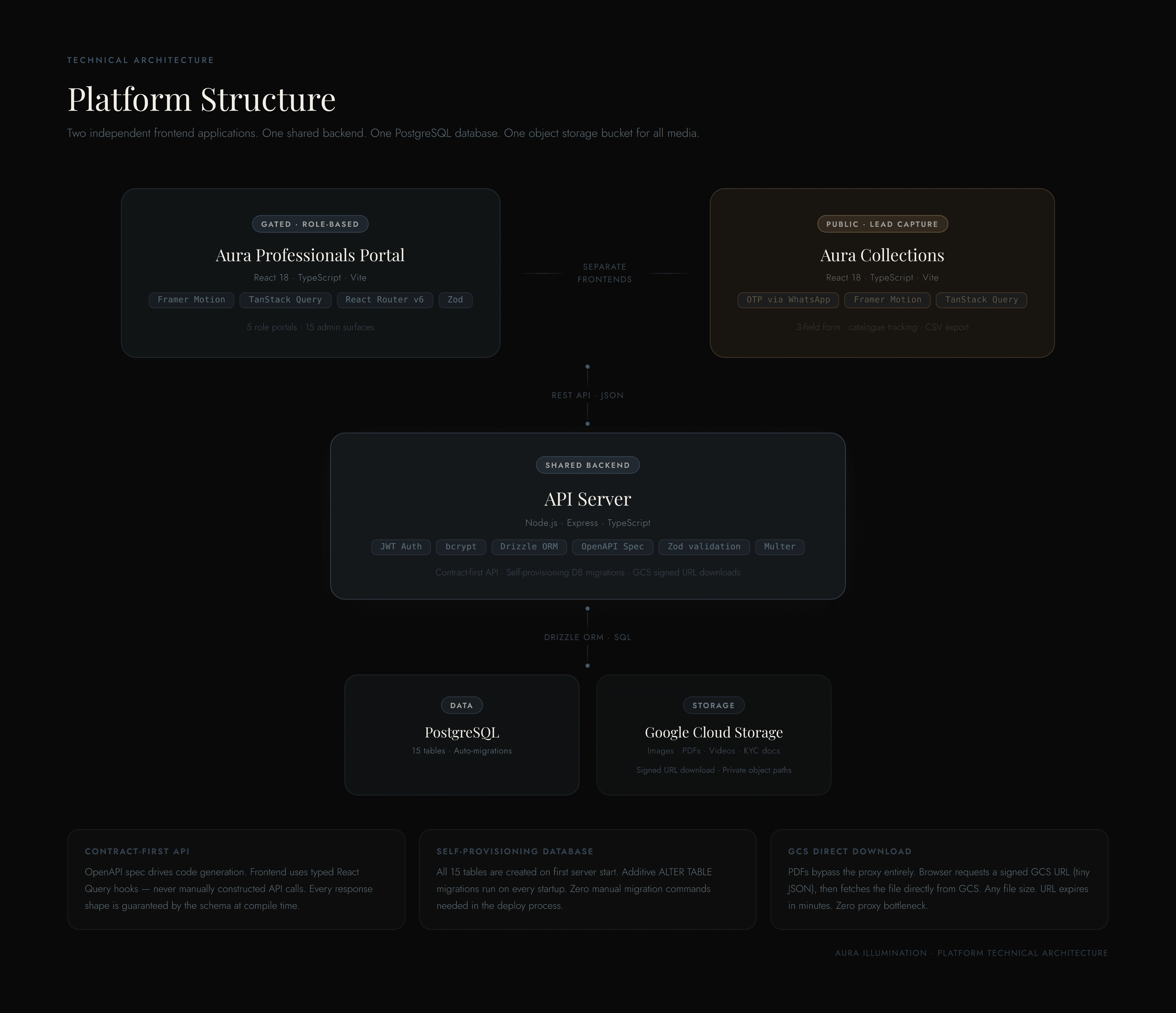
A luxury lighting brand's entire partner programme ran on WhatsApp threads and spreadsheets. I replaced it with two interconnected digital products — a role-based loyalty portal for 5 types of users, and a public catalogue app for lead capture — designed end to end and shipped with AI-assisted engineering.
Aura Illumination works with India's top architecture and design studios. Their referral programme, product catalogues, and partner relationships all existed informally — tracked manually, communicated individually, with no digital home. The brief was to give the programme credibility: a platform where architects could see their points, track referrals, and access resources without calling anyone. What it became was a full partner ecosystem — two apps, one shared backend, a design system built from the ground up, role-based access control across five user types, and a structured B2B onboarding flow.
A premium lighting brand's partner programme ran entirely on WhatsApp and spreadsheets. Architects had no way to check their points, track referrals, or access catalogues without calling the sales team. There was no digital record of anything, no role-based access system, and no structured onboarding for new partner firms.
THE PROBLEM & APPROACH
1.1 The Problem
Aura Illumination's partner programme for architects existed entirely as an informal agreement. Referrals — when an architect's client purchased Aura lighting for a project — were tracked in a shared spreadsheet. Points were calculated manually. Architects had no way to check their own balance. Catalogues were WhatsApp'd as PDFs. Every piece of programme communication was one-to-one, handled by the sales team.
Three things were broken:
The programme had no credibility. Architects were told they were earning points toward rewards, but had no dashboard, no statement, no confirmation — just the sales team's word. Formal programme, informal evidence.
Content operations couldn't scale. Every product update, new catalogue PDF, or announcement required the sales team to message each firm individually. There was no broadcast mechanism.
Catalogue enquiries left no trace. When a prospect called to see Aura's product range, the sales team WhatsApp'd a PDF. No record of who asked, which catalogues they viewed, or any follow-up data.
1.2 The Approach
Before opening a design tool, I mapped every user's relationship to the system.
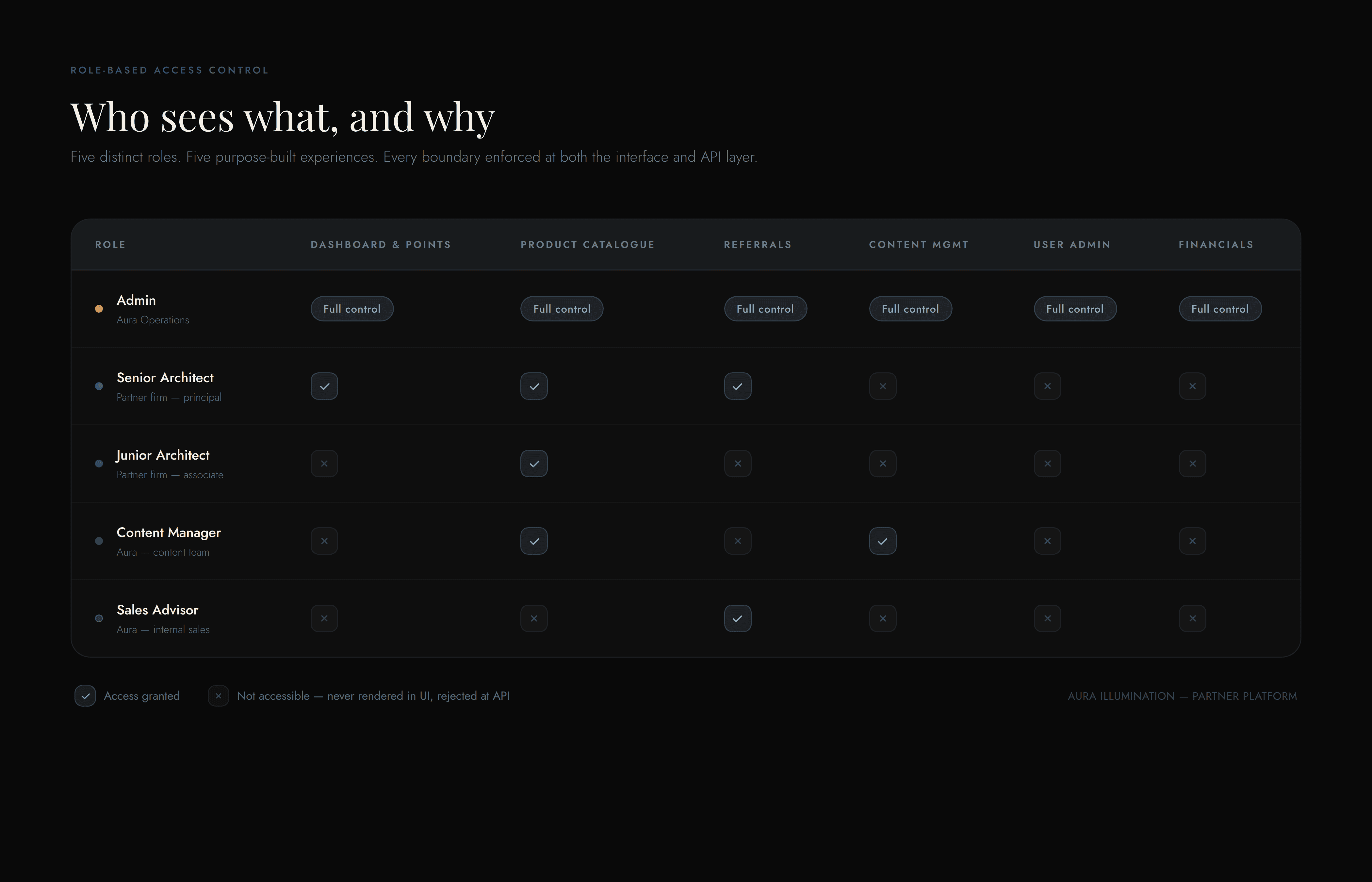
The platform serves five fundamentally different users — Admin, Senior Architect, Junior Architect, Content Manager, and Sales Advisor. Each has a different mental model, different data access needs, and different goals per session. The wrong move is to design screens first and discover role conflicts later.
This mapping became the first design artefact. It dictated every navigation decision, every data-access rule, and every permission boundary in the platform.
Role
Primary goal
What they must never see
Admin
Manage everything, approve requests
Nothing hidden
Senior Architect
Check points, submit redemptions, track referrals
Other firms' financials
Junior Architect
Browse catalogue, download 3D assets
Points, redemption flows
Content Manager
Update products, publish catalogues
User financials, approvals
Sales Advisor
Track own clients and referral KPIs
Other advisors' clients
DISCOVERY & DEFINITION
This project didn’t begin with a formal research phase — no interview programme, no usability lab. It began with a brief, a client, and a workflow that was fully visible: the entire partner programme lived in WhatsApp threads and a referral spreadsheet. The problem didn’t need to be discovered through research; it needed to be defined precisely enough to design against.
The working material:
The client brief — Aura’s team described what the programme was supposed to be: points for referrals, tiered travel rewards, catalogues for partners. And what it actually was: a spreadsheet, a phone, and one sales team holding everything together.
The existing workflow itself — every operational fact the design needed was already on the table. Referrals tracked manually. Points calculated by hand. Catalogues sent one-to-one as PDFs. No record of prospect enquiries. Each of these became a design requirement.
The five roles the programme already had — principal architects, their junior team members, Aura’s admin, content operations, and the internal sales team weren’t invented for the platform. They existed in the informal programme; the platform had to serve each of them properly for the first time.
The defining insight:
The most important realisation of the definition phase: one platform was actually three. A principal architect needs a verifiable record of points and referrals. A junior architect needs a product library with 3D assets — and no financial noise. A sales advisor needs their own client pipeline. Designing one interface for all of them would have failed each of them.
That insight became the project’s first design artefact — the role–access matrix (shown in the next section) — produced before any screens were designed. Every navigation decision, permission boundary, and even the decision to build Collections as a separate product traces back to it.
An honest note on research:
The reflection section of this case study says it directly: earlier testing with actual architects is the first thing I’d change about this project. The role definitions were built from the client’s knowledge of their partners, not from firsthand partner interviews — and the design carries that assumption. It’s also why the platform was built to be validated in production-grade code with real data, where assumptions surface fast, rather than in static mockups where they can hide.
THE DESIGN PROCESS
The project ran in five phases over roughly four months — but not as a waterfall. Phases 3 and 4 ran as tight loops: design a flow, build it in production-grade code, review it against each role’s context, revise.
01 — Frame. Working from the client brief and the visible reality of the WhatsApp-and-spreadsheet workflow, the problem was framed as three failures: no credibility (points without evidence), no scalability (one-to-one content operations), and no lead capture (enquiries left no trace). Each failure mapped to a product surface.
02 — Define. Before any screens, every role was mapped against every data type. The role–access matrix became the first design artefact of the project — it dictated navigation, permissions, and which product each user type should even be in. The information architecture diagram followed directly from it.
03 — Design. The design system came first: the dark editorial direction, Playfair Display + Jost pairing, and the slate-blue accent — then each role shell was designed directly in high fidelity within the live build, where the navigation logic could be tested per role with real routing and real data rather than simulated in static mockups.
04 — Build & iterate. AI-assisted engineering made the build loop fast enough that iteration happened in the product, not in mockups. The onboarding flaw was caught this way: designing the admin’s account-creation flow in the working product made it concrete that an admin would be typing a partner firm’s bank details into a form — a trust and liability problem that a static mockup would have made easy to overlook. The redesigned handoff shipped within the same phase.
05 — Ship & harden. Production launch, then the unglamorous work that makes a platform real: diagnosing the PDF download failure, adding OTP gating to Collections, and resolving 34 security vulnerabilities.
Why design in production-grade code?
The conventional process — static mockups, then clickable prototype, then build — inserts two translation layers between design intent and shipped product. With AI-assisted engineering, the live build was the design surface. Every flow was evaluated as actual behaviour with actual data. Feedback was never “I imagine this would feel slow” — it was “this is slow, here, on my phone.” That fidelity is what surfaced the onboarding trust flaw before launch instead of after — and every design artefact in this case study is drawn from the shipped product itself.
ROLE-BASED ACCESS CONTROL (RBAC)
One of the core design challenges was ensuring that employees, clients, and key customers each saw exactly what they needed — and nothing else. Not a watered-down version of a single interface. A purpose-built experience for each role.
The rejected approach: one shell with hidden items.
A single sidebar with items shown or hidden by role sounds efficient. It isn’t. Hidden-but-present items create cognitive noise — a junior architect who sees 12 sidebar items with 4 greyed out wonders what they’re missing. It signals a lesser version of something. It also creates a security surface: access control enforced only at the UI level is fragile. Determined users can navigate to URLs they can’t see.
The built approach: role-based shells with server-enforced boundaries.
Each role gets its own purpose-built navigation component. More importantly, every access restriction is enforced twice — at the UI level (the navigation doesn’t render routes the user can’t access) and at the API level (server middleware rejects requests from sessions that don’t have the required role, regardless of how the request was made).
The five role experiences:
Admin — a 15-tab command centre with full CRUD across every entity: users, organisations, referrals, products, announcements, brands, reward tiers, KYC records, sales advisors, and catalogue PDFs. Admin is the control plane of the entire platform.
Senior Architect — a tab-based personal dashboard. Loyalty card showing tier and points. Tier Journey progress toward named travel rewards. Referral history. Team member management. Key Contacts tab with direct access to Aura’s MD, Sales Manager, and Operations Manager. No access to other firms’ data.
Junior Architect — a catalogue-focused portal. 9-category product library with 3D asset downloads, featured products, bespoke lighting showcase, PDF catalogues, and brand directory. No financial data. No referral flows. The portal feels complete, not restricted.
Content Manager — an operational dashboard with full control over content surfaces (products, catalogues, brands, announcements) and no visibility into financials or user management. Clean separation of operations from administration.
Sales Advisor — a completely separate login at /sa with its own authentication context. Their dashboard shows only their own clients, referral history, and KPIs. They never enter the partner portal’s session system.
Exclusive customer portals:
Beyond internal roles, the platform includes a dedicated public-facing portal — Aura Collections— that gives prospects (architects not yet in the partner programme) gated access to the product catalogue. A three-field entry form unlocks the full library. Every session is tracked. The prospect never creates an account, never sets a password, and never interacts with the partner system. It is a purpose-built access environment for a specific user type.
This is RBAC at the product level: not just who can see what inside a system, but which system each user type should be in at all.
MULTI-STEP B2B ONBOARDING
Onboarding a new architecture firm into the partner programme is not a consumer sign-up flow. It’s a B2B account setup — with an organisation profile, multiple users under one firm, KYC documentation, and financial details for reward processing.
The original flow — and why it was wrong.
In the initial design, the admin was responsible for entering everything during account creation: firm name, GST number, PAN, bank account number, and IFSC code. The rationale was operational speed — the admin knows the firm, they already have a relationship, they can just add the details.
The problem was immediately apparent: you are asking an internal admin to type a partner firm’s banking details into a system. This is a data trust problem, a data accuracy problem, and a liability problem. If those details are wrong — a transposed digit in an account number — the firm doesn’t receive their reward. If those details are intercepted, the firm’s financial information has been compromised through a channel they didn’t control.
The redesigned flow — client-completed financial details.
I redesigned the onboarding as a handoff:
Admin creates the account — firm name, primary contact, role assignment. This takes 60 seconds.
Admin sends the invite — the partner receives a login link.
Partner completes their own profile — on first login, they are directed to a setup flow where they enter their own financial details: bank account, IFSC, PAN, GST number.
The result: sensitive financial information is entered by the account holder, not a third party. The admin never handles banking details. The partner firm has verified that their own details are correct. The platform’s data integrity for reward processing is dramatically higher.
The multi-step structure:
The first-login setup flow is divided into clear steps — not one long form — because the information being requested spans different mental contexts (personal information, professional registration, banking). Breaking it into steps reduces cognitive load and allows the system to save progress at each step (partial completion is preserved; the partner can finish later without starting over).
The admin sees a completion status indicator on each partner’s profile — a clear signal of whether their setup is complete or pending financial details. This makes it easy to follow up on incomplete accounts without guessing.
WHY THIS MATTERS FOR B2B SaaS
The onboarding flow is where enterprise products are won or lost. A clunky setup experience signals that the rest of the product will be difficult. A smooth, well-sequenced onboarding that respects who is doing what — and why — signals that the team understands their users.
The key principle here is appropriate ownership of data entry. In B2B contexts, different people in the workflow own different information. Designing for that reality — rather than making one role responsible for everything because it's operationally convenient — is what separates thoughtful B2B product design from a form with a lot of fields.
KEY DESIGN DECISIONS
1 — The Bespoke Lighting Showcase Modal
Bespoke products (handcrafted pieces starting at ₹1.5 lakh) were displayed in the same grid card format as standard catalogue items. A hand-blown Venetian pendant — one of the most expensive things Aura makes — was getting the same visual weight as a ₹12,000 wall bracket.
I designed a full-screen showcase viewer that takes over when any bespoke product is opened. The product image fills the stage. Navigation arrows sit at the edges. A thumbnail strip runs below all product images — all clickable. Keyboard shortcuts (← → Escape) work throughout. Product details — material, starting price, description, product code — appear in a side panel that never obscures the image.
Role-aware detail: for senior architects, a points badge appears. For juniors, it’s hidden — they see the product’s beauty without being anchored to financial value they can’t access.
The modal took about a day to build. Its effect on the perceived quality of the entire platform was disproportionate to the build time. Premium products need premium presentation moments. If every product gets the same layout, nothing feels special.
2 — The Tier Journey Progress Card
An architect sitting at 1,45,000 points sees a number without context. The loyalty programme uses named travel rewards as milestones:
Starter → Bronze (2,00,000 pts): Visit to Italy
Bronze → Silver (2,50,000 pts): Visit to Spain
Silver → Gold (3,50,000 pts): Visit to Japan
The Tier Journey card gives that number meaning. An animated progress bar runs from the last threshold to the next, with the destination reward named. “55,000 points from Italy” is a motivating number. “1,45,000 points” alone is not.
Loyalty programmes live or die by whether members feel progress. Visible, meaningful progress toward a named, desirable reward is the difference between a programme people care about and one they forget.
3 — The Avatar Nudge System
Profile photos matter for a partner programme — architects meet Aura’s team at site visits, showroom events, and trade fairs. But in early usage, almost no one uploaded one.
I designed three layers of nudge for Junior architects: a pulsing indicator dot on the “My Profile” sidebar nav item (visible from anywhere in the portal), a contextual banner inside the Profile page itself, and a camera overlay on the avatar circle on hover.
All three disappear immediately when a photo is uploaded — no page reload. The response is instant; the completion feels rewarded.
For Senior architects, a softer prompt: an “Add photo” hint with camera icon below the greeting header avatar. No pulsing dot — senior partners get the hint, not the nudge.
The system is persistent but never disruptive. Optional actions that matter need progressive disclosure, not a one-time empty state that’s easy to close and forget.
4 — The Design System: Dark Luxury Editorial
Aura had a wordmark and product photography. No UI language, no type scale, no defined colour palette.
Visual direction: A near-black #090909 background puts every product image on a stage — exactly how premium lighting showrooms work. Warm amber product imagery looks its best on dark surfaces.
Type pairing: Playfair Display (editorial serif) for all headings, loyalty card labels, and tier names. Jost (geometric sans) for all functional UI — form labels, tables, navigation. Both self-hosted as variable font files — no Google Fonts, no external dependency.
Primary accent:#475867 (desaturated slate-blue) — deliberately not gold or amber, which would compete with the photography. The slate reads premium and restrained.
Motion: Frequent actions (table sorts, filters) get no animation — instant response. Occasional transitions (modal opens, page changes) get 200–400ms ease-out. First-time moments (loyalty card reveal, tier progress) can afford delight.
5 — The Sales Advisor Portal: Separate Auth Context
Sales Advisors (Aura’s internal sales team) needed their own performance dashboard. But they’re not partner architects — mixing them into the partner auth system would have required awkward role-flagging throughout the codebase and permission exceptions on every endpoint.
I designed a completely separate login at /sa with its own authentication session. Their portal shows only their own client directory, referral history, and KPIs. They never enter the partner system.
Clean separation of auth contexts is easier to reason about and easier to secure than one system with increasingly complex exceptions. The separate login screen is a feature, not friction — it signals that this is a different tool for a different purpose.
Infrastructure & Troubleshooting
WHEN THE PRODUCT BROKE IN PRODUCTION
After launch, architects reported that PDF catalogue downloads were consistently arriving as empty files. The file appeared to download — the browser showed a completed download — but the file opened as blank.
This was a critical issue. The catalogues are core to why partner architects use the platform. If they can't reliably download them, the platform fails its most basic promise.
Identifying the pattern.
I documented the failure: it happened consistently with larger PDF files (above a certain size threshold), not with small files or images. It happened in the production environment but not in development. This suggested the issue was in the production infrastructure, not the file storage or download code itself.
Working with Replit to diagnose it.
I reported the failure pattern to Replit's AI troubleshooting tools, providing the reproduction steps, file size threshold, and environment-specific behaviour. The diagnosis identified that the hosting proxy layer was silently dropping large streaming response bodies — file headers arrived at the browser, but the file bytes were cut off in transit. It was a silent failure, not an error — which is what made it hard to catch.
The solution.
Replit's engineering support helped implement a fix: instead of streaming the file through the proxy, the download flow was changed to use a signed URL approach. The browser requests a short-lived secure link directly to the file's storage location, then fetches the file straight from Google Cloud Storage — bypassing the proxy entirely. From the architect's perspective: PDFs now download completely, every time, at any file size.
The design lesson.
I didn't write the fix — but I identified the failure, documented it clearly enough for the right tools to diagnose it, and stayed in the loop on the solution to understand what changed and why. In product work, that's the right division of responsibility: the designer owns the problem clearly enough that the right people can solve it.
Silent failures erode trust faster than visible errors. A visible error says "something went wrong." A file that downloads and opens blank says "this platform can't be relied on." Getting that fix shipped was a product priority, not a technical one.
Outcomes & Metrics
THE OUTCOME
Two live applications. One shared backend. One design system. Five role-controlled portal experiences.
OTP-verified lead records with per-catalogue view tracking
Partner onboarding
Admin typed the firm’s bank details
Partner completes their own financial setup on first login
Programme communication
Individual messages per firm
One admin action broadcasts to every partner
What changed for partners:
Architects now have a dashboard showing every referral they submitted, the exact points earned, and their progress toward a named travel reward — in real time, without calling anyone. The programme went from a verbal promise backed by a spreadsheet to a verifiable, real-time record.
What changed for onboarding:
New partner firms complete their own financial and KYC details after first login — not entered on their behalf by an admin. Sensitive information is owned and verified by the account holder. The admin’s onboarding task is limited to what only they should control: account creation and role assignment.
What changed for operations:
Aura’s team can publish product updates, upload catalogue PDFs (up to 130 MB), post video announcements, and manage the brand directory entirely without developer involvement. What previously required individual WhatsApp messages to each partner firm now requires one admin action.
What changed for sales:
Every catalogue enquiry that previously disappeared into a WhatsApp thread now generates a structured lead record with contact details and per-catalogue view tracking. The sales team has a downloadable CSV with qualified intent signals — not just a name and number. A firm that specifically opened the Bespoke Collection is a different sales conversation from a firm that browsed the standard range.
Reflection
WHAT I’D DO DIFFERENTLY
Earlier user testing with actual architects.
The tab structure for the Senior dashboard — My Referrals, Team Members, Key Contacts — felt logical from the information architecture. With more time, I’d run sessions with two or three real partners before shipping, specifically testing whether they intuitively find the redemption flow and understand the tier system without being told how to read it.
A token library before the first component.
I established the colour palette and type scale early, but built components and defined tokens in parallel rather than in sequence. Defining all spacing, radius, shadow, and motion tokens in one focused session before building would have eliminated the handful of visual inconsistencies I had to clean up midway through — and would have made the system easier to hand off.
OTP-gated access for Aura Collections from day one.
The three-field form works for access, but fake data is trivially entered. Phone OTP verification — which was later added — should have been the gate from launch. Every day it wasn’t live meant lead records of unknown reliability. It was the right product decision. It was the wrong delivery timeline.
More depth in the Sales Advisor portal.
The /sa dashboard was the last surface built and it shows. The core KPI cards and referral history are solid, but the client directory deserved more craft — specifically, a firm-level view grouping all referrals by client with aggregate value. That view would make performance review conversations possible to run directly off the platform.
WHAT SURPRISED ME
The financial details onboarding change had an outsized effect on data quality.
Asking the admin to enter a partner firm’s banking details seemed operationally convenient. Redesigning it so the partner enters their own details seemed like a small process change. The actual impact — partners confirming their own account numbers, catching their own errors, feeling ownership over their financial setup — was meaningfully larger than the design change suggested.
Small handoff decisions in B2B onboarding carry significant downstream consequences. Who enters what, and when, shapes the reliability of the entire system’s data.
Role isolation is harder than it looks.
The five-role architecture is deceptively complex. Every new feature requires asking: which roles see this, at what fidelity, with what permissions? Getting it wrong — even subtly — breaks trust. The discipline of building separate portal shells, not a single shell with flags, made every feature decision cleaner. But the maintenance cost is real: any design change has to be evaluated against every role’s context separately.
Infrastructure problems are product problems.
The PDF download failure was a production infrastructure issue. But its impact was entirely experiential — architects couldn’t access catalogues. Identifying it clearly, documenting the reproduction pattern, and understanding the fix well enough to verify the outcome: that’s the product designer’s contribution to an engineering problem. You don’t have to write the fix. You have to own the problem.
The bespoke modal raised the ceiling.
The showcase modal for bespoke products elevated the perceived quality of the entire platform disproportionately to its scope. Interfaces have a ceiling — the best interaction sets expectations for everything else. Invest in raising that ceiling. Everything below it will benefit.